Client IVAN [SE] · Scope Brand identity / Product design
IVAN makes jewellery, treated as sculptures to be worn — tactile pieces defined by silhouette and scale.
We shaped the brand from the first lookbook. Raw bodies, high contrast, and imagery letting each piece stand on its own.
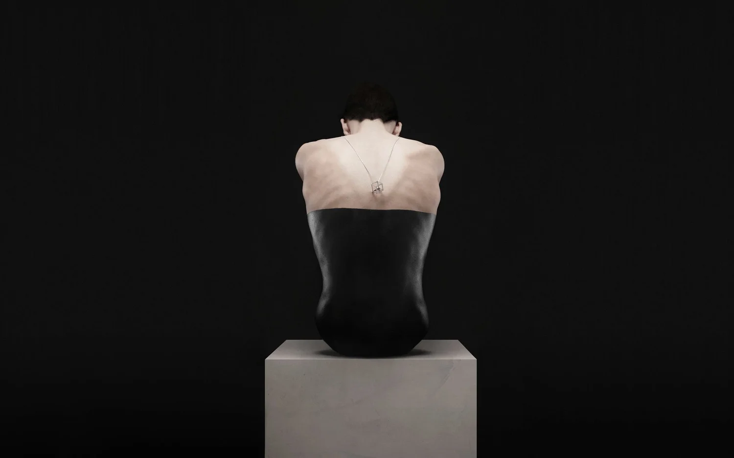
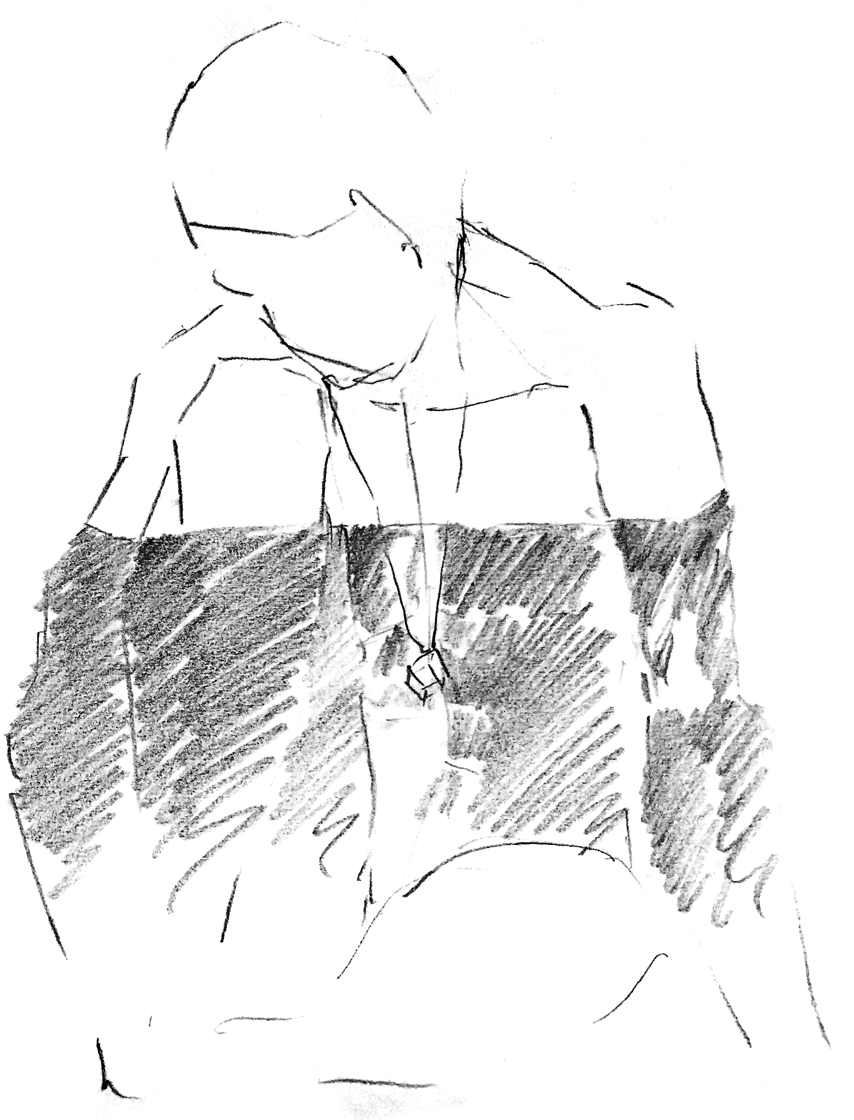
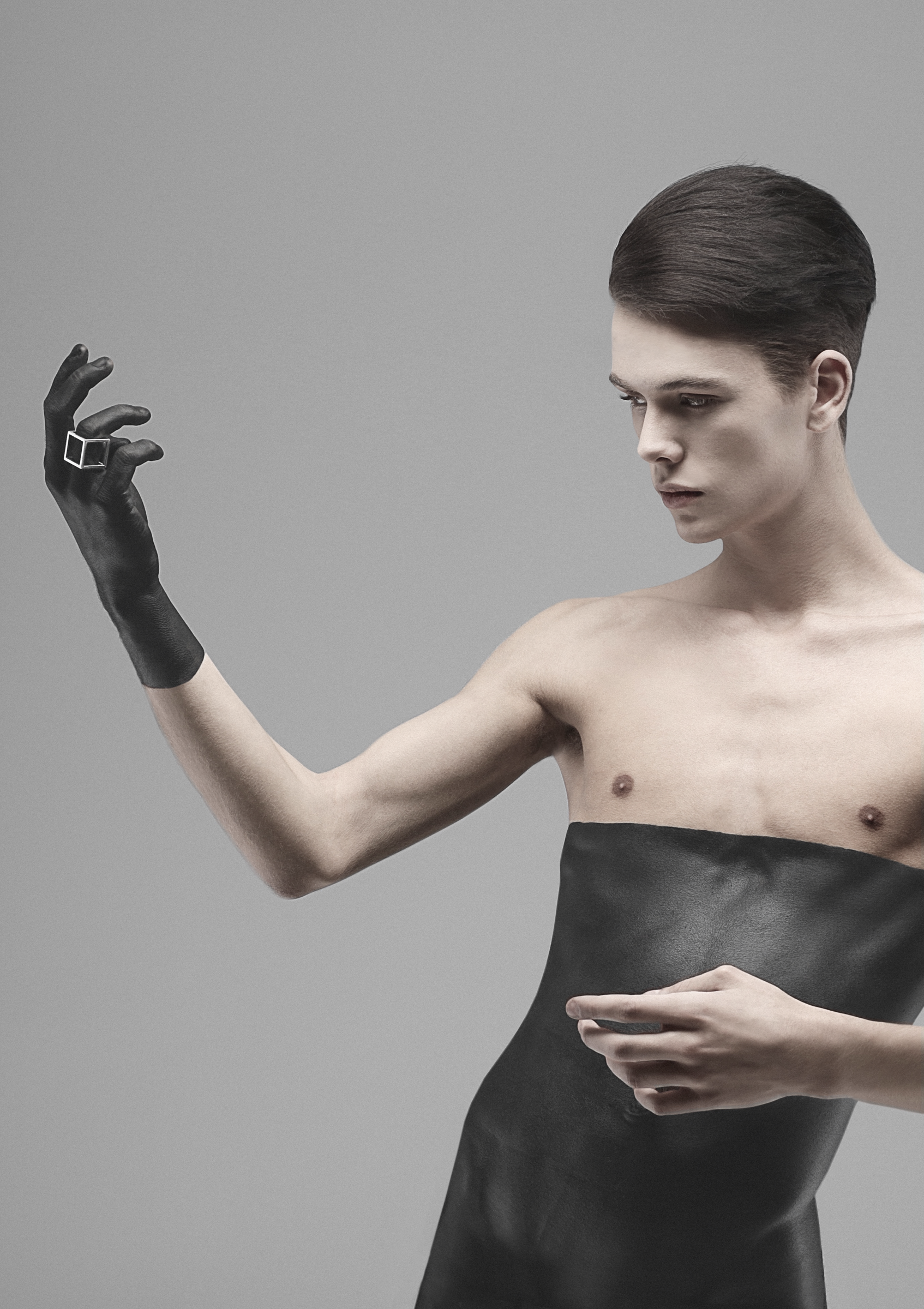
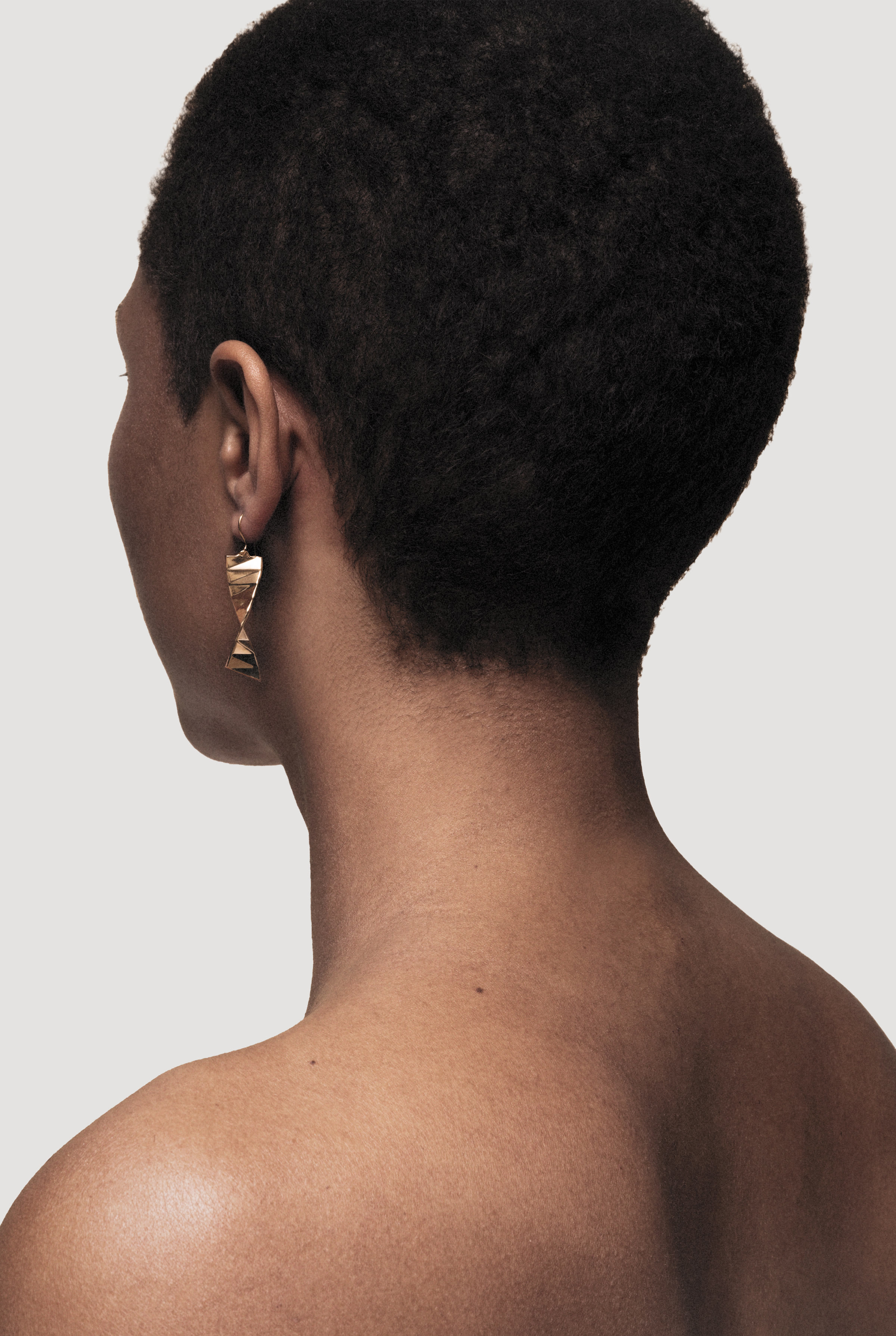

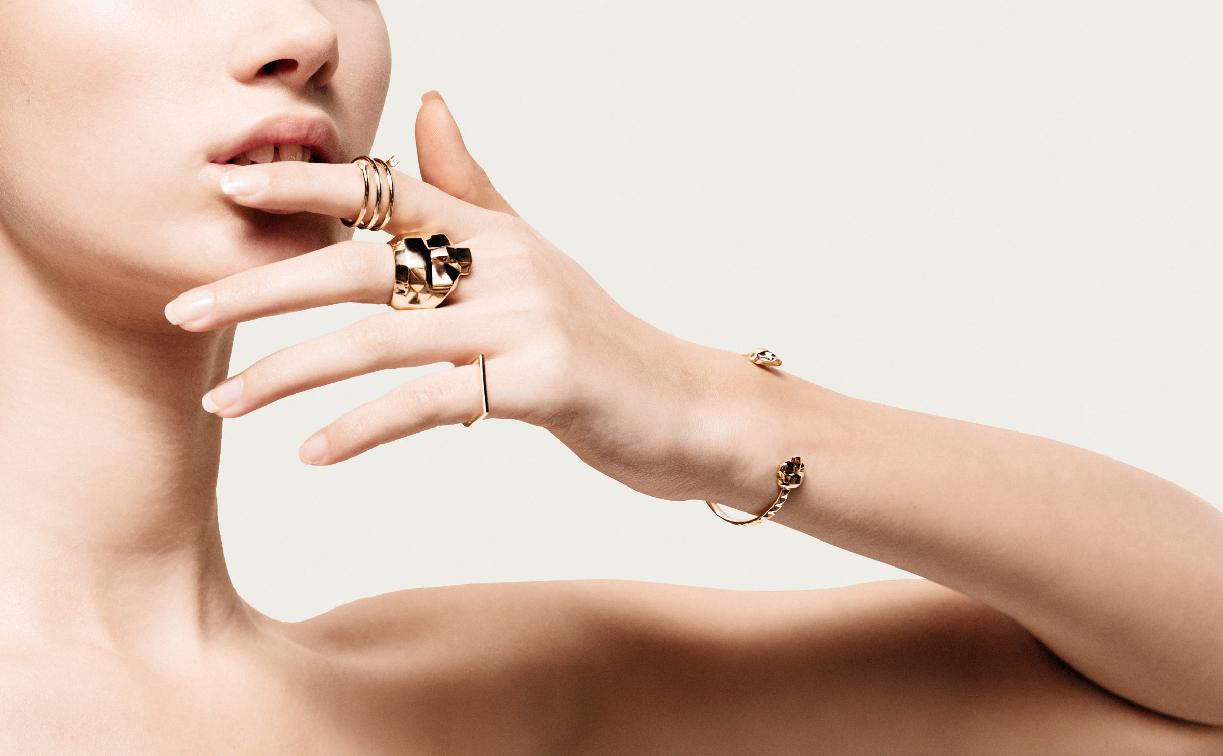
Shape, material and construction carried from the jewellery into naming, packaging and graphic communication.
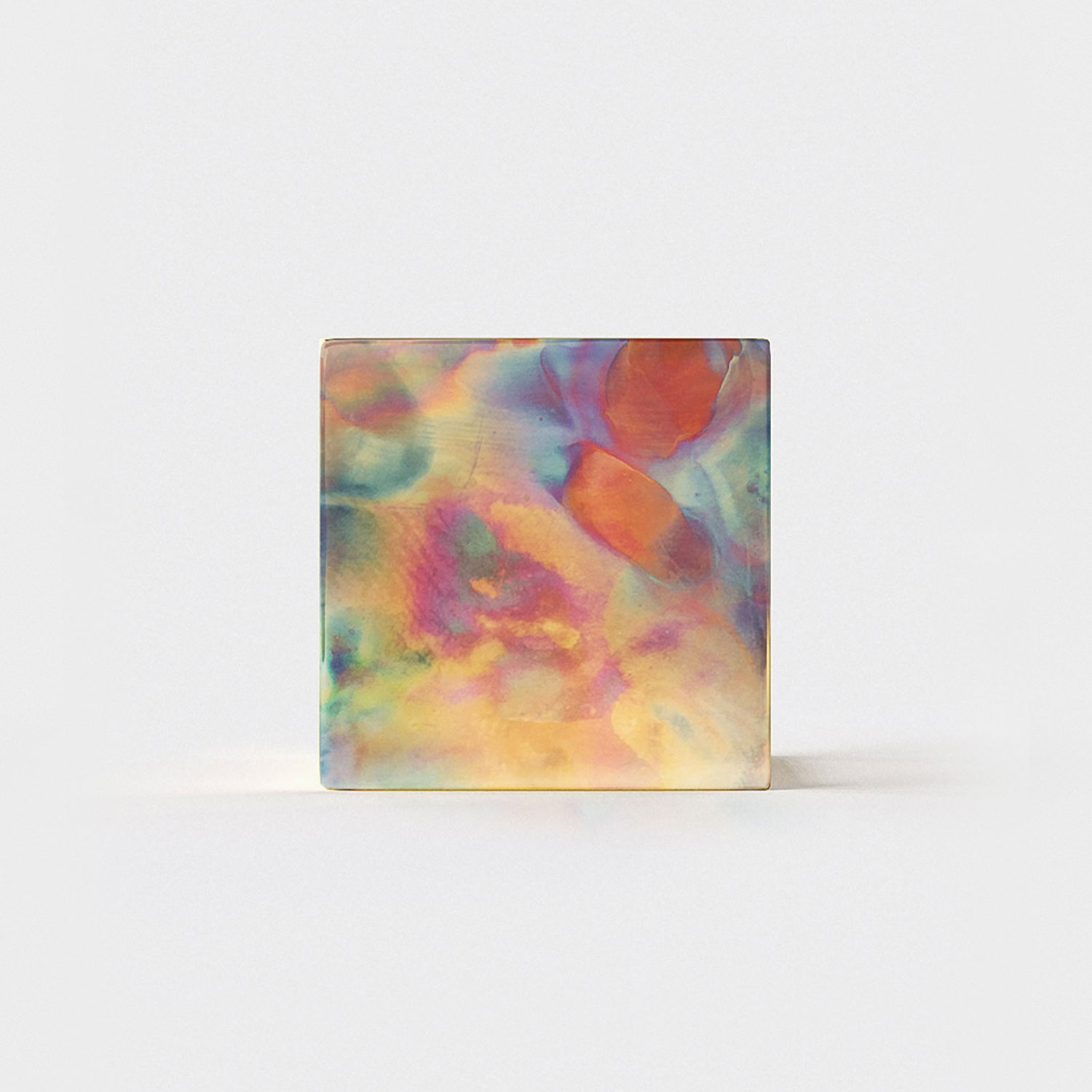
Names followed shape and material. Bruised Cube took its colour from copper transformed by heat.
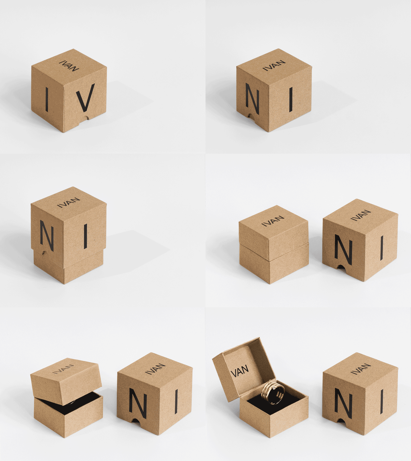
Craft paper brought a tactile, deliberately unpolished quality to the packaging.
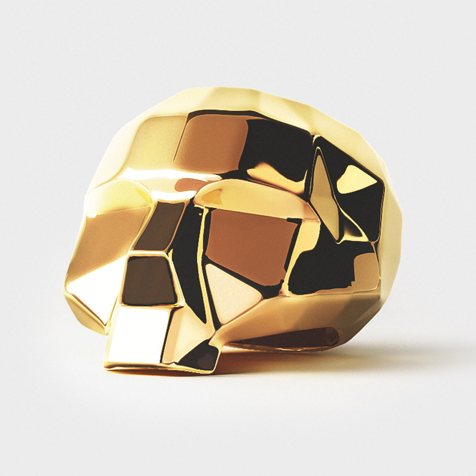
Neutral backgrounds and consistent lighting kept attention on form, material and construction.
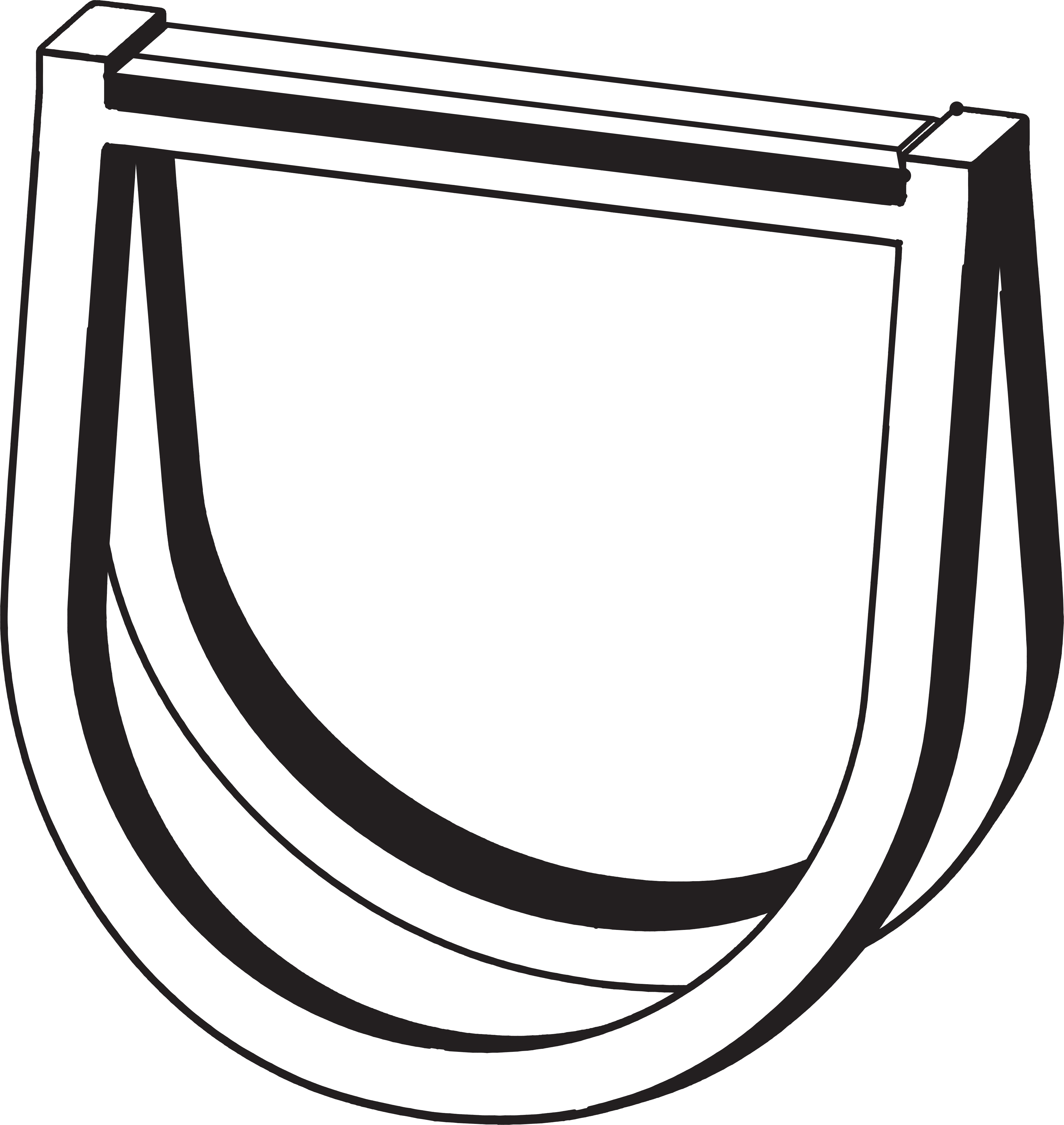
Each piece became a pictogram, identifying the jewellery on labels and line sheets.
An identity shaped by contrast and form. At once sensible and senseless.